Network Plan
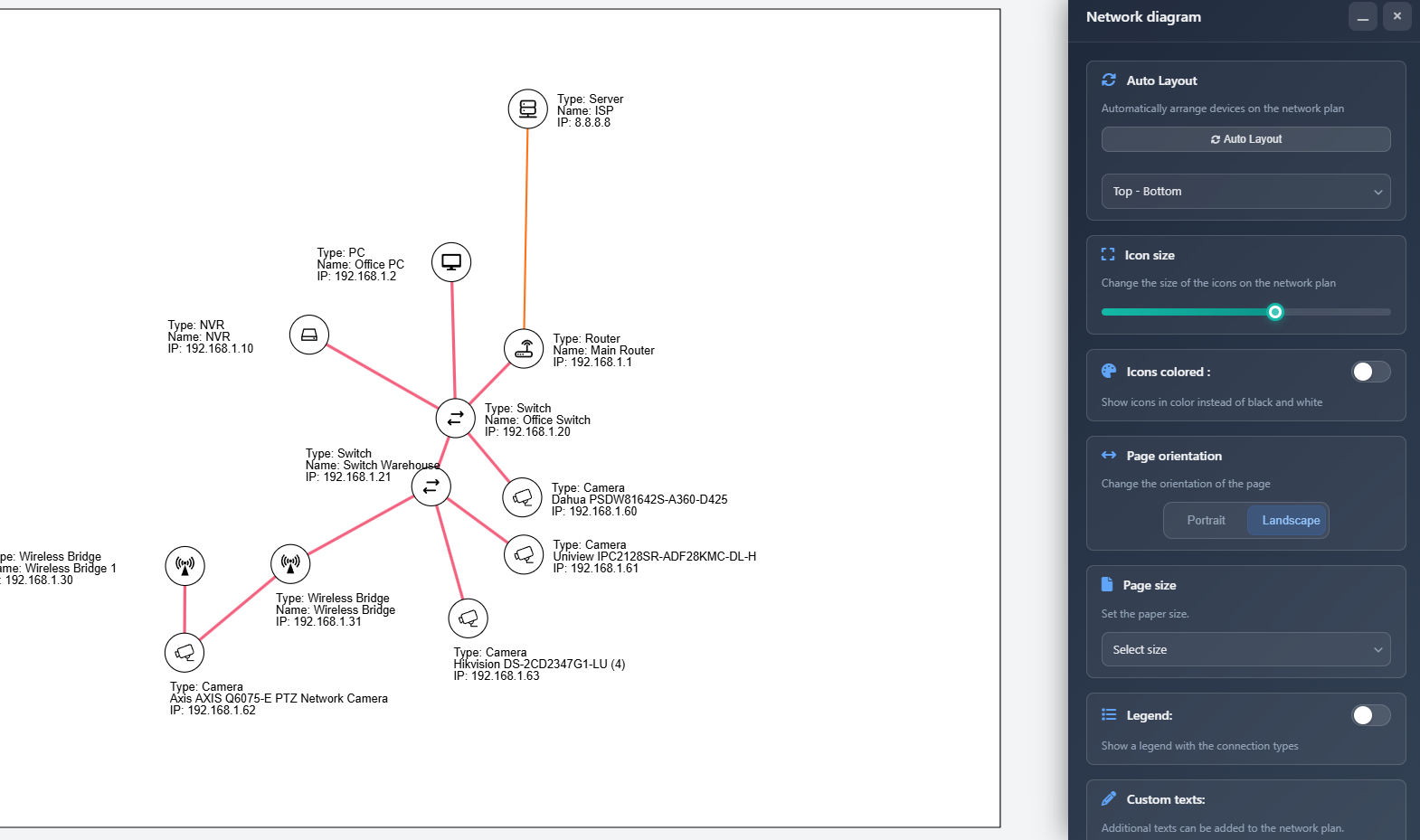
The Network Plan feature creates an interactive network diagram visualization of your project's devices, cameras, and connections. It automatically generates a structured diagram showing how all network components are connected, with customizable layout, styling, and export options. You can manually adjust device positions, add custom text labels, configure visual appearance, and export the diagram as JPG or PDF for documentation and presentations.
The Network Plan includes powerful design tools for creating professional diagrams: multi-select and alignment tools for precise positioning, grid display with snap-to-grid for consistent spacing, icon visibility controls for focusing on specific network segments, and right-click context menus for quick actions. All connections automatically update when devices are moved, and hidden devices automatically hide their connections as well.
When to use this
- When you need to create a visual network diagram showing all devices and their connections
- When preparing network documentation for installation teams or clients
- When you want to visualize the network topology and data flow in your system
- When you need to export professional network diagrams for proposals or technical documentation
- When you want to customize the layout and appearance of your network diagram
Opening the Network Plan
To access the Network Plan feature:
- Click on the Network diagram icon (fa fa-network-wired) in the left toolbar.
- The Network Plan interface will open, showing a canvas with your network diagram and a sidebar with configuration options.
If this is the first time opening the Network Plan for your project, the system will automatically arrange all devices and cameras using the auto-layout algorithm.
Auto layout
The Auto Layout feature automatically arranges all devices and cameras in your network diagram. This creates a clean, organized structure that clearly shows connections between devices.
- Auto Layout button – Click to automatically rearrange all devices and cameras on the canvas
- Orientation – Choose the layout direction:
- Left-Right (LR) – Devices flow from left to right
- Right-Left (RL) – Devices flow from right to left
- Top-Bottom (TB) – Devices flow from top to bottom (default)
- Bottom-Top (BT) – Devices flow from bottom to top
The auto-layout algorithm considers all connections between devices and arranges them to minimize overlapping and create a clear visual hierarchy. After running auto-layout, you can still manually adjust device positions by dragging them on the canvas.
Icon size
The Icon Size slider controls the size of device and camera icons in the network diagram:
- Adjust the slider to change icon size from 5 to 30 pixels
- Larger icons make devices more visible but take up more space
- Smaller icons allow more devices to fit on the canvas
- The size affects both device icons and camera icons equally
Icons colored
The Icons Colored toggle controls whether device icons are displayed in color or as simple white circles:
- Enabled – Icons display in their configured colors (device icon colors or default type colors)
- Disabled – All icons display as white circles with black borders
Colored icons help visually distinguish different device types, while monochrome icons create a cleaner, more uniform appearance.
Grid
The Grid feature provides visual alignment guides and snap-to-grid functionality to help you create precise, organized network diagrams:
- Grid toggle – Enable or disable the grid display on the canvas
- Snap to grid – When enabled, icons automatically align to grid lines when dragged
- Grid size – Adjust the grid spacing from 10 to 100 pixels (default: 40px)
The grid appears as subtle lines on the canvas, with every 5th line slightly darker for easier reference. When snap-to-grid is enabled, dragging any icon will automatically position it to the nearest grid intersection, ensuring consistent alignment and spacing throughout your diagram.
Page orientation
Set the orientation of the exported network diagram:
- Portrait – Vertical orientation (taller than wide)
- Landscape – Horizontal orientation (wider than tall)
The orientation affects both the canvas view and the exported PDF/JPG file.
Page size
Select the paper size for your network diagram export:
- A4, A3, A2, A1, A0 – Standard ISO paper sizes
- Letter, Legal, Tabloid – North American paper sizes
The selected page size determines the dimensions of the canvas and the exported file. Larger sizes (A2, A1, A0) are useful for complex networks with many devices, while smaller sizes (A4, Letter) are suitable for simpler networks or digital viewing.
Icon visibility
The Icon Visibility panel (collapsed by default) allows you to show or hide individual devices and cameras in your network diagram:
- Expand/Collapse – Click the chevron icon in the panel header to expand or collapse the visibility list
- Show all / Hide all – Quick action buttons to show or hide all icons at once
- Filter – Type in the search box to filter the list by device name
- Toggle visibility – Use the toggle switch next to each device to show or hide it
When an icon is hidden:
- The icon and its label are not displayed on the canvas
- All connections to that device are also hidden automatically
- Hidden items appear dimmed in the visibility list for easy identification
This feature is useful for focusing on specific parts of your network, creating simplified views for presentations, or temporarily removing devices from the diagram without deleting them.
Legend
The Legend feature displays a visual guide showing all connection types used in your network diagram:
- Legend toggle – Enable or disable the legend display
- Legend position – Choose where the legend appears:
- Top Left – Upper left corner
- Top Right – Upper right corner
- Bottom Left – Lower left corner
- Bottom Right – Lower right corner
The legend shows each connection type with its corresponding line style, color, and width, making it easy to understand what each connection line represents in your diagram. The legend is draggable, allowing you to reposition it if needed.
Custom texts
You can add custom text labels to your network diagram for annotations, titles, or additional information:
- Add Text button – Click to add a new text object to the diagram
- Text input – Enter or edit the text content for each text object
- Styling button – Click the pencil icon to open styling options for a text object
Text styling
When you click the styling button for a text object, an overlay dialog appears with styling options:
- Color – Choose the text color using the color picker
- Font size – Set the font size from 8 to 72 pixels
- Apply to all texts – Button to apply the current styling to all text objects in the diagram
Text objects are draggable on the canvas, allowing you to position them anywhere on the diagram. You can select multiple text objects (see Multi-select below) and move them together or align them using the alignment toolbar.
File type
Choose the export format for your network diagram:
- JPG – Image format suitable for digital use and presentations
- PDF – Document format ideal for printing and professional documentation
The file type selection determines the format of the exported file when you click the Export button.
Canvas interaction
The Network Plan canvas is fully interactive, allowing you to manipulate the diagram:
- Drag devices – Click and drag any device or camera icon to reposition it on the canvas
- Drag labels – Click and drag device labels to reposition them relative to their devices
- Drag texts – Click and drag custom text objects to move them anywhere on the canvas
- Drag canvas – Click and drag empty areas of the canvas to pan the view
- Zoom – Use the mouse wheel to zoom in and out (0.1x to 2x)
- Touch gestures – On mobile devices, use pinch-to-zoom and two-finger pan gestures
The canvas automatically prevents dragging devices or labels onto connection lines or other devices to maintain diagram clarity.
Multi-select and alignment
You can select multiple items (devices, cameras, labels, or custom texts) and manipulate them together:
Selecting items
- Single click – Click an icon, label, or text to select it (deselects previous selection)
- Ctrl/Cmd/Shift + click – Hold Ctrl (Windows/Linux) or Cmd (Mac) or Shift while clicking to add items to your selection
- Rubber band selection – Click and drag on empty canvas to draw a selection rectangle that selects all items within it
- Escape key – Press Escape to clear all selections
Selected items are highlighted with a blue border and dashed outline. When you select 2 or more items, a floating alignment toolbar appears at the top of the canvas.
Multi-drag
When multiple items are selected, dragging any one of them moves all selected items together by the same distance. This maintains relative positions while allowing you to reposition entire groups of devices, labels, or texts simultaneously.
Alignment toolbar
The alignment toolbar appears when 2 or more items are selected, providing quick alignment and distribution options:
- Align Left – Aligns all selected items to the leftmost position
- Align Right – Aligns all selected items to the rightmost position
- Align Top – Aligns all selected items to the topmost position
- Align Bottom – Aligns all selected items to the bottommost position
- Align Center Horizontal – Centers all items vertically (same Y coordinate)
- Align Center Vertical – Centers all items horizontally (same X coordinate)
- Distribute Horizontal – Evenly spaces items horizontally between the leftmost and rightmost items
- Distribute Vertical – Evenly spaces items vertically between the topmost and bottommost items
- Deselect all – Clears the selection (also available via Escape key)
The alignment toolbar works with any combination of devices, cameras, labels, and custom texts, allowing you to create perfectly aligned and organized diagrams.
Device labels
Each device and camera in the network diagram displays an automatically generated label showing:
- Device type – The type of device (e.g., Router, Switch, Camera)
- Name – The device's display name or camera model
- IP address – The device's IP address (if configured)
Labels are positioned automatically to avoid overlapping with connection lines. You can manually adjust label positions by dragging them, and the system will remember your custom positions.
Label connector line
When a label is selected or being dragged, a subtle blue dashed line appears connecting the label to its device icon. This visual guide helps you see which label belongs to which device, especially when labels are positioned far from their icons. The connector line includes a small anchor dot at the label end for clear visual reference.
Label selection and multi-select
Labels can be selected independently from their device icons:
- Click on label – Selects the label (not the icon)
- Click on icon – Selects the icon (not the label)
- Multi-select labels – Use Ctrl/Cmd/Shift + click or rubber band selection to select multiple labels
- Multi-drag labels – When multiple labels are selected, dragging one moves all selected labels together
Labels can be included in alignment operations along with devices, cameras, and custom texts.
Right-click context menu
Right-clicking on any device or camera icon opens a context menu with quick actions:
- Hide icon / Show icon – Toggles the visibility of the selected device or camera. When hidden, the icon, its label, and all connections to it are removed from the diagram
- Reset label position – Resets the label position to its automatically calculated position, removing any custom positioning
The context menu displays the device name and icon type at the top for easy identification. Click anywhere outside the menu to close it.
Exporting
To export your network diagram:
- Configure all settings (page size, orientation, icon size, etc.)
- Arrange devices and add any custom texts as needed
- Click the Export button at the bottom of the sidebar
- The diagram will be exported in the selected format (JPG or PDF) and downloaded to your computer
The export includes:
- All devices and cameras with their current positions
- All connection lines with their configured styles
- Custom text objects
- Legend (if enabled)
- Page size and orientation settings
Tips
- Use Auto Layout first to get a good starting arrangement, then manually adjust positions as needed
- Choose the orientation (TB, LR, etc.) that best fits your network structure before fine-tuning positions
- Use larger icon sizes for presentations and smaller sizes for detailed documentation
- Enable colored icons when you need to quickly identify device types, use monochrome for a cleaner look
- Add custom texts to label network segments, add titles, or provide additional context
- Position the legend in a corner that doesn't interfere with your network diagram
- Use A3 or A2 page sizes for complex networks with many devices to ensure everything is visible
- Remember that device labels can be repositioned if they overlap with connections
- Export as PDF for printing and JPG for digital presentations or email sharing
- Enable the grid when you need precise alignment – it helps create professional, organized diagrams
- Use snap-to-grid for consistent spacing between devices, especially when creating structured layouts
- Multi-select devices using rubber band selection or Ctrl+click to quickly align or distribute groups of devices
- Use the alignment toolbar to create perfectly aligned rows or columns of devices
- Hide unused devices using the Icon Visibility panel or right-click menu to focus on specific network segments
- Select labels independently from icons to fine-tune label positioning without moving devices
- Use multi-drag to move entire groups of devices while maintaining their relative positions
- Right-click on icons for quick access to hide/show and label reset functions
- Combine alignment tools with grid snapping for pixel-perfect diagram layouts