App Settings
The App Settings sidebar provides comprehensive customization options for the visual appearance and behavior of your CCTV Design Tool workspace. You can configure language preferences, measurement units, device colors and sizes, display names, camera appearance, connection styles, wall properties, field of view settings, and many other visual elements. These settings allow you to personalize the application to match your workflow preferences and create consistent, professional-looking designs.
When to use this
- When you want to customize the visual appearance of your workspace and design elements
- When you need to change measurement units (metric/imperial) for your project
- When you want to configure connection types, colors, and styles for network diagrams
- When you need to adjust field of view display settings, colors, and opacity
- When you want to save your preferred settings as defaults for future projects
Opening App Settings
To access App Settings:
- Click on the Settings menu in the left toolbar.
- Select App Settings from the dropdown menu.
- The App Settings sidebar will appear on the right side of the screen.
WARNING
Some settings may require specific user permissions. If you don't have permission to change app settings, a warning message will be displayed, and you'll need to contact your administrator.
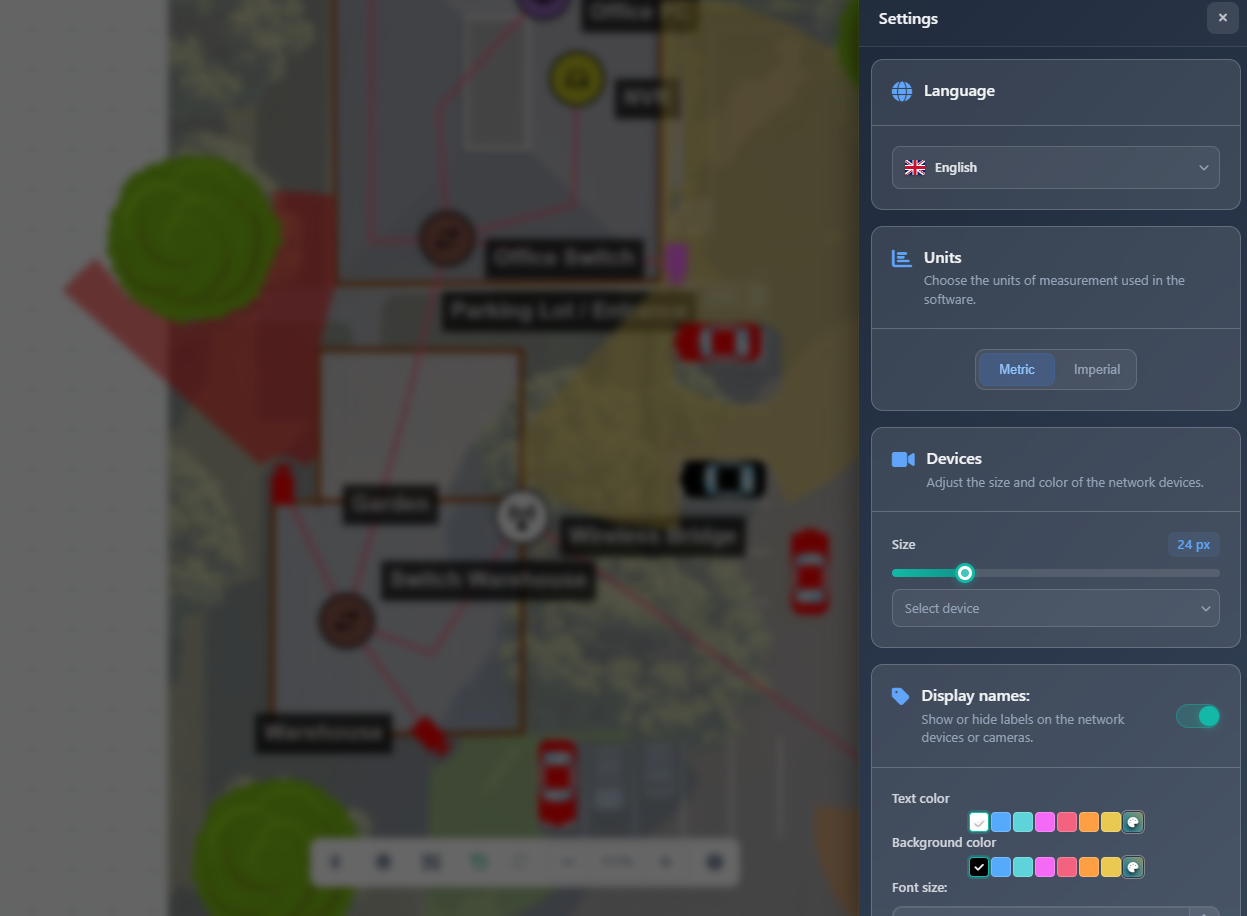
Language
The Language setting allows you to change the interface language of the application:
- Select your preferred language from the dropdown
- The interface will update immediately to reflect your language choice
- Language preference is saved and persists across sessions
Units
The Units setting controls the measurement system used throughout the application:
- Metric – Meters (m) for distances and measurements
- Imperial – Feet (ft) for distances and measurements
Changing units affects all height measurements, cable length calculations, and distance displays throughout the application.
Devices
The Devices section allows you to customize the appearance of network devices:
Device size
Adjust the size of all device icons on the canvas using the slider (5-90 pixels). This setting affects both cameras and network devices uniformly.
Device colors
Configure default colors for different device types:
- Select a device type from the dropdown (e.g., Router, Switch, Access Point)
- Use the color picker to set the default color for that device type
- New devices of that type will use the selected color by default
This helps create visual consistency and makes it easier to identify different device types in your designs.
Display names
The Display Names section controls how text labels appear on your project:
- Toggle – Enable or disable display names on the canvas
- Text color – Set the color of display name text
- Background color – Set the background color for display name labels
- Font size – Adjust the font size of display names (1-100 pixels)
When enabled, display names appear next to cameras and devices, making it easier to identify items in your design.
Camera shape
The Camera Shape toggle controls how cameras are displayed:
- Disabled (default) – Modern camera icons with customizable appearance
- Enabled – Classic camera shape icons
This is a visual preference that affects how camera symbols appear on your canvas.
Camera index
The Camera Index toggle (only available when Camera Shape is disabled) controls whether camera numbers are displayed:
- Enabled – Camera numbers appear on the canvas instead of or alongside camera icons
- Disabled – Camera icons are displayed normally
Camera index numbers help with referencing specific cameras in discussions and documentation.
DORI color scheme
The DORI Color Scheme section allows you to customize the colors used for DORI (Detection, Observation, Recognition, Identification) zones:
- Detect – Color for the detection zone (outermost)
- Observe – Color for the observation zone
- Recognize – Color for the recognition zone
- Identify – Color for the identification zone (innermost)
These colors appear on camera FOVs when DORI zones are enabled, helping visualize effective ranges for different surveillance purposes.
Connections
The Connections section allows you to manage connection types and their visual appearance. Click on the Connections card to enter connection editing mode.
Connection editing mode
When you click the Connections card, you enter a dedicated editing mode where you can:
- Select connection type – Choose from existing connection types (LAN, WIFI, WAN, FIBER, etc.) or user-created types
- Configure color – Set the line color for the selected connection type
- Set thickness – Choose line thickness from 1-10 pixels
- Choose style – Select line style: Solid, Dashed, or Dotted
User connections
For user-created connection types:
- Rename – Edit the connection type name using the name input field
- Delete – Remove the connection type (only if no connections are using it)
Adding new connection types
Click Add New to create a custom connection type. The new type will appear in connection type lists throughout the application.
Click Back to App Settings to return to the main settings view.
Walls
The Walls section controls the appearance of wall objects:
- Walls color – Set the color of wall lines on the canvas
- Thickness – Choose wall line thickness from 1-10 pixels
These settings affect all walls drawn in your project and help create clear visual distinction between walls and other elements.
Field of view
The Field of View section controls how camera FOVs are displayed:
- Color – Set the default color for FOV visualizations
- Opacity – Adjust FOV transparency from 0% (fully transparent) to 100% (fully opaque) using the slider
- Rounded FOV threshold – Set the angle threshold (0-150°) at which FOV switches from rounded to square display.
These settings help you balance FOV visibility with canvas clarity, ensuring FOVs don't obscure important details while remaining visible.
Channel arrows
The Channel Arrows section controls the appearance of direction arrows on camera FOVs:
- Color – Set the arrow color
- Arrow width – Adjust arrow line thickness from 0-25 pixels
- Text size – Set the font size for arrow text labels from 0-80 pixels
Direction arrows help clarify camera viewing direction, especially when FOV is hidden.
PPM line
The PPM Line section controls the appearance of the PPM (Pixel Per Meter) measurement line:
- Line width – Set the thickness of the PPM line from 1-25 pixels
- Line style – Choose the line style: Solid, Dashed, or Dotted
The PPM line appears when PPM display is enabled and helps visualize pixel density at specific distances.
Scrim
The Scrim feature adds a semi-transparent overlay layer on top of the project background image to improve contrast and prevent objects from blending into the background:
- Toggle – Enable or disable the scrim overlay
- Color – Set the scrim color when enabled
- Opacity – Adjust scrim transparency from 0% to 100%
When your background image is too bright or too dark, the scrim layer helps create better visual separation between the background and objects placed on the canvas, making cameras, devices, and other elements more visible and easier to distinguish.
Default colors
The Default Colors section provides six customizable color slots that can be used throughout the application:
- Each color slot has a color picker and text input for the hex color code
- These colors serve as quick-access defaults for various elements
- Colors are saved with your settings and available across projects
Show fog effect
The Show Fog Effect toggle controls whether background images from lower floors are visible when viewing higher floors:
- Enabled – Background images from lower floors are visible with a fog/mist effect applied, providing context from previous floors
- Disabled – Only the current floor's background image is displayed
When enabled and viewing a higher floor, you can see the background images from lower floors dimmed with a fog effect, helping you maintain spatial context while working on multi-level projects.
Advanced mode
The Advanced Mode toggle enables additional advanced options and features:
- Enabled – Advanced features and options become available
- Disabled – Standard features only
Advanced mode unlocks additional configuration options for power users who need more control over the application behavior.
Saving and loading settings
At the bottom of the App Settings sidebar, you'll find three action buttons:
Save as default
Click Save as Default to save your current settings as your default preferences. These settings will be automatically applied to new projects and can be loaded later.
Load saved settings
Click Load Saved Settings to restore your previously saved default settings, overwriting any current settings.
Reset to default
Click Reset to Default to restore all settings to the application's default values. This is useful if you've made changes you want to undo or if you want to start fresh.
Tips
- Save your preferred settings as defaults to maintain consistency across all your projects
- Use device colors to create visual consistency and make device types easily identifiable
- Adjust FOV opacity to balance visibility with canvas clarity
- Customize connection types and colors to match your organization's standards or client preferences
- Set appropriate wall thickness to ensure walls are visible but don't dominate the canvas
- Use DORI color schemes that provide good contrast for easy zone identification
- Configure display names with appropriate font sizes and colors for readability
- Create custom connection types for specialized network configurations
- Remember that some settings (like units) affect calculations, so choose carefully
- Test different opacity and color combinations to find what works best for your workflow